转载:
阮一峰:Flex 布局教程:语法篇
2009年,W3C 提出了一种新的方案—-Flex 布局,可以简便、完整、响应式地实现各种页面布局。目前,它已经得到了所有浏览器的支持,这意味着,现在就能很安全地使用这项功能。
转载:
知乎专栏:CSS布局十八般武艺都在这里了
参考:
CSS 常见布局方式
CSS水平居中+垂直居中+水平/垂直居中的方法总结
目录
常用居中方法
居中在布局中很常见,我们假设DOM文档结构如下,子元素要在父元素中居中:1
2
3<div class="parent">
<div class="child"></div>
</div>
水平居中
子元素为行内元素还是块状元素,宽度一定还是宽度未定,采取的布局方案不同。
子元素为:
行内元素:对父元素设置text-align:center;
定宽块状元素: 设置左右margin值为auto;
不定宽块状元素: 设置子元素为display:inline,然后在父元素上设置text-align:center;
通用方案: flex布局,对父元素设置display:flex;justify-content:center;
例子:
固定宽度
这种方式是绝对定位居中,除了使用 margin,我们还可以使用 transform(注意浏览器兼容性,只适用于 ie9+,移动开发请忽略)1
2
3
4
5
6
7
8
9
10
11
12
13
14
15
16
17.container{
width: 300px;
height: 200px;
background: pink;
position: relative;
}
.inner{
width: 100px;
height: 50px;
position: absolute;
top: 50%;
left: 50%;
margin-top: -25px;
margin-left: -50px;
background: #fff;
text-align: center;
}
1 | .container{ |
宽度未知
将子元素设置为行内元素,然后父元素设置 text-align: center。1
2
3
4
5
6
7
8
9
10.container{
width: 300px;
height: 200px;
background: pink;
position: relative;
text-align: center;
}
.inner{
display: inline-block;
}
多个块状元素
上面的方式即使子元素不止一个也想实现水平居中也是有效的,(宽度固定不固定都可,不固定的话就不需要设置宽度,会被自动撑开,但是要考虑到撑爆的情况)例如:1
2
3
4
5
6
7
8
9
10
11
12
13
14
15
16.container{
width: 250px;
height: 200px;
background: pink;
position: relative;
text-align: center;
padding: 20px;
}
.inner{
display: inline-block;
width: 50px;
height: 150px;
margin: 0 auto;
background: #fff;
text-align: center;
}
当然也可以使用我们刚刚介绍的 flex,我们只需要让子元素在主轴上的对齐方式设置为居中就可以1
2
3
4
5
6
7
8
9
10
11
12
13
14.container{
width: 250px;
height: 200px;
background: pink;
display: flex;
justify-content: center;
padding: 20px;
}
.inner{
background: #fff;
width: 50px;
height: 150px;
margin-left: 10px;
}
垂直居中
垂直居中对于子元素是单行内联文本、多行内联文本以及块状元素采用的方案是不同的。
父元素一定,子元素为单行内联文本:设置父元素的height等于行高line-height
父元素一定,子元素为多行内联文本:设置父元素的display:table-cell或inline-block,再设置vertical-align:middle;
块状元素:设置子元素position:absolute并设置top、bottom为0,父元素要设置定位为static以外的值,margin:auto;
通用方案:flex布局,给父元素设置{display:flex; align-items:center;}。
单列布局
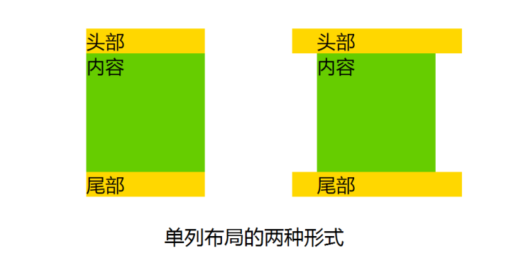
特征:定宽、水平居中
常见的单列布局有两种:
一种是header、content、footer宽度都相同,其一般不会占满浏览器的最宽宽度,但当浏览器宽度缩小低于其最大宽度时,宽度会自适应。
一种是header、footer宽度为浏览器宽度,但content以及header和footer里的内容却不会占满浏览器宽度。
对于第一种,对header、content、footer统一设置width或max-width,并通过margin:auto实现居中。
DOM文档:1
2
3
4
5<div class="layout">
<div id="header">头部</div>
<div id="content">内容</div>
<div id="footer">尾部</div>
</div>
CSS清单:1
2
3
4
5.layout{
/* width: 960px; *//*设置width当浏览器窗口宽度小于960px时,单列布局不会自适应。*/
max-width: 960px;
margin: 0 auto;
}
对于第二种,header、footer的内容宽度为100%,但header、footer的内容区以及content统一设置width 或 max-width,并通过margin:auto实现居中。
DOM文档:1
2
3
4
5
6
7<div id="header">
<div class="layout">头部</div>
</div>
<div id="content" class="layout">内容</div>
<div id="footer">
<div class="layout">尾部</div>
</div>
CSS清单:1
2
3
4
5.layout{
/* width: 960px; *//*设置width当浏览器窗口宽度小于960px时,单列布局不会自适应。*/
max-width: 960px;
margin: 0 auto;
}
二列&三列布局
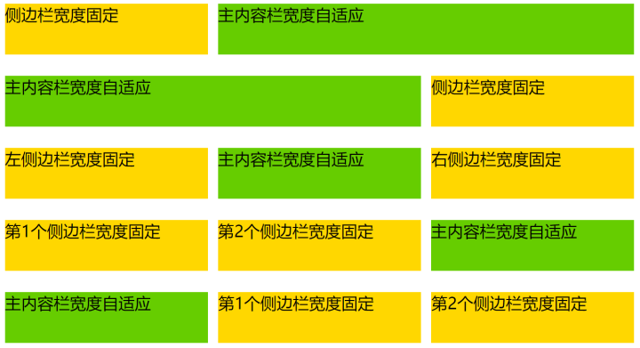
二列布局的特征是侧栏固定宽度,主栏自适应宽度。
三列布局的特征是两侧两列固定宽度,中间列自适应宽度。
之所以将二列布局和三列布局写在一起,是因为二列布局可以看做去掉一个侧栏的三列布局,其布局的思想有异曲同工之妙。对于传统的实现方法,主要讨论上图中前三种布局,经典的带有侧栏的二栏布局以及带有左右侧栏的三栏布局,对于flex布局,实现了上图的五种布局。
float + margin
原理说明:设置两个侧栏分别向左向右浮动,中间列通过外边距给两个侧栏腾出空间,中间列的宽度根据浏览器窗口自适应。
DOM文档:1
2
3
4
5<div id="content">
<div class="sub">sub</div>
<div class="extra">extra</div>
<div class="main">main</div>
</div>
布局步骤:
对两边侧栏分别设置宽度,并对左侧栏添加左浮动,对右侧栏添加有浮动。
对主面板设置左右外边距,margin-left的值为左侧栏的宽度,margin-right的值为右侧栏的宽度。
CSS清单:1
2
3
4
5
6
7
8
9
10
11
12.sub{
width: 100px;
float: left;
}
.extra{
width: 200px;
float: right;
}
.main{
margin-left: 100px;
margin-right: 200px;
}
一些说明:
注意DOM文档的书写顺序,先写两侧栏,再写主面板,更换后则侧栏会被挤到下一列(圣杯布局和双飞翼布局都会用到)。
这种布局方式比较简单明了,但缺点是渲染时先渲染了侧边栏,而不是比较重要的主面板。
二列的实现方法
如果是左边带有侧栏的二栏布局,则去掉右侧栏,不要设置主面板的margin-right值,其他操作相同。反之亦然。
position + margin
原理说明:通过绝对定位将两个侧栏固定,同样通过外边距给两个侧栏腾出空间,中间列自适应。
DOM文档:1
2
3<div class="sub">left</div>
<div class="main">main</div>
<div class="extra">right</div>
布局步骤:
对两边侧栏分别设置宽度,设置定位方式为绝对定位。
设置两侧栏的top值都为0,设置左侧栏的left值为0, 右侧栏的right值为0。
对主面板设置左右外边距,margin-left的值为左侧栏的宽度,margin-right的值为右侧栏的宽度。
CSS清单:1
2
3
4
5
6
7
8
9
10
11
12
13
14.sub, .extra {
position: absolute;
top: 0;
width: 200px;
}
.sub {
left: 0;
}
.extra {
right: 0;
}
.main {
margin: 0 200px;
}
一些说明:
本方法不限制DOM书写顺序,先写主面板会使主面板部分优先渲染(一般主面板会比侧栏内容重要)。
与上一种方法相比,本种方法是通过定位来实现侧栏的位置固定。
如果中间栏含有最小宽度限制,或是含有宽度的内部元素,则浏览器窗口小到一定程度,主面板与侧栏会发生重叠。
二列的实现方法
如果是左边带有侧栏的二栏布局,则去掉右侧栏,不要设置主面板的margin-right值,其他操作相同。反之亦然。
圣杯布局 (float + 负margin)
原理说明:
主面板设置宽度为100%,主面板与两个侧栏都设置浮动,常见为左浮动,这时两个侧栏会被主面板挤下去。通过负边距将浮动的侧栏拉上来,左侧栏的负边距为100%,刚好是窗口的宽度,因此会从主面板下面的左边跑到与主面板对齐的左边,右侧栏此时浮动在主面板下面的左边,设置负边距为负的自身宽度刚好浮动到主面板对齐的右边。为了避免侧栏遮挡主面板内容,在外层设置左右padding值为左右侧栏的宽度,给侧栏腾出空间,此时主面板的宽度减小。由于侧栏的负margin都是相对主面板的,两个侧栏并不会像我们理想中的停靠在左右两边,而是跟着缩小的主面板一起向中间靠拢。此时使用相对布局,调整两个侧栏到相应的位置。
DOM文档:1
2
3
4
5 <div id="bd">
<div class="main">center</div>
<div class="sub">left</div>
<div class="extra">right</div>
</div>
布局步骤:
三者都设置向左浮动。
设置main宽度为100%,设置两侧栏的宽度。
设置 负边距,sub设置负左边距为100%,extra设置负左边距为负的自身宽度。
设置main的padding值给左右两个子面板留出空间。
设置两个子面板为相对定位,sub的left值为负的sub宽度,extra的right值为负的extra宽度。
CSS清单:1
2
3
4
5
6
7
8
9
10
11
12
13
14
15
16
17
18
19
20
21.main {
float: left;
width: 100%;
}
.sub {
float: left;
width: 190px;
margin-left: -100%;
position: relative;
left: -190px;
}
.extra {
float: left;
width: 230px;
margin-left: -230px;
position: relative;
right: -230px;
}
#bd {
padding: 0 230px 0 190px;
}
一些说明
DOM元素的书写顺序不得更改。
主面板部分优先渲染(一般主面板会比侧栏内容重要)。
当面板的main内容部分比两边的子面板宽度小的时候,布局就会乱掉。可以通过设置main的min-width属性或使用双飞翼布局避免问题。
二列的实现方法
如果是左边带有侧栏的二栏布局,则去掉右侧栏,不要设置主面板的padding-right值,其他操作相同。反之亦然。
双飞翼布局 (float + 负margin)
原理说明:
双飞翼布局和圣杯布局的思想有些相似,都利用了浮动和负边距,但双飞翼布局在圣杯布局上做了改进,在main元素上加了一层div, 并设置margin,由于两侧栏的负边距都是相对于main-wrap而言,main的margin值变化便不会影响两个侧栏,因此省掉了对两侧栏设置相对布局的步骤。
DOM文档:1
2
3
4
5<div class="main-wrap">
<div class="main">#main</div>
</div>
<div class="sub">left</div>
<div class="extra">right</div>
布局步骤:
三者都设置向左浮动。设置main-wrap宽度为100%,设置两个侧栏的宽度。设置负边距,sub设置负左边距为100%,extra设置负左边距为负的自身宽度。
设置main的margin值给左右两个子面板留出空间。
CSS清单:1
2
3
4
5
6
7
8
9
10
11
12
13
14
15
16
17.main-wrap {
float: left;
width: 100%;
}
.sub {
float: left;
width: 190px;
margin-left: -100%;
}
.extra {
float: left;
width: 230px;
margin-left: -230px;
}
.main {
margin: 0 230px 0 190px;
}
一些说明
主面板部分优先渲染(一般主面板会比侧栏内容重要)。
圣杯采用的是padding,而双飞翼采用的margin,解决了圣杯布局main的最小宽度不能小于左侧栏的缺点。
双飞翼布局不用设置相对布局,以及对应的left和right值。
通过引入相对布局,可以实现三栏布局的各种组合,例如对右侧栏设置position: relative; left: 190px;,可以实现sub+extra+main的布局。
二列的实现方法
如果是左边带有侧栏的二栏布局,则去掉右侧栏,不要设置main-wrap的margin-right值,其他操作相同。反之亦然。
flex布局
以下是五种布局的flex布局代码:
DOM文档:1
2
3
4
5
6
7
8
9
10
11
12
13
14
15
16
17
18
19
20
21
22
23<div class="layout">
<aside class="aside">侧边栏宽度固定</aside>
<div class="main">主内容栏宽度自适应</div>
</div>
<div class="layout">
<div class="main">主内容栏宽度自适应</div>
<aside class="aside">侧边栏宽度固定</aside>
</div>
<div class="layout">
<aside class="aside">左侧边栏宽度固定</aside>
<div class="main">主内容栏宽度自适应</div>
<aside class="aside">右侧边栏宽度固定</aside>
</div>
<div class="layout">
<aside class="aside">第1个侧边栏宽度固定</aside>
<aside class="aside">第2个侧边栏宽度固定</aside>
<div class="main">主内容栏宽度自适应</div>
</div>
<div class="layout">
<div class="main">主内容栏宽度自适应</div>
<aside class="aside">第1个侧边栏宽度固定</aside>
<aside class="aside">第2个侧边栏宽度固定</aside>
</div>
CSS清单1
2
3
4
5
6
7
8
9.layout {
display: flex;
}
.main {
flex: 1;
}
.aside {
width: 200px;
}
与之前所讲的几种传统布局方案相比,flex布局的代码可谓异常简洁,而且非常通用,利用简单的三行CSS即实现了常见的五种布局。
总结
传统的布局方法基于盒状模型,依赖 display属性 + position属性 + float属性,逻辑相对复杂,对于实现一些特殊效果,例如垂直居中,尤其复杂繁琐。而flex布局中的flex容器可以根据实际可用空间动态调整子元素的宽高比和顺序,使元素能够尽可能地利用可用空间,同时也能通过缩小来避免超出。flex布局提供了一套简便、完整、响应式的布局方案。
